Thursday, April 21, 2011

The Ivy Portfolio Review and Tests

The Ivy Portfolio by Mebane Faber is a great read and is a staple reference in my library.

Take a look at this chart:
 I'd say that's a pretty decent return on a strategy since 2008. + 36% return vs. -3.6% on the S&P 500.  The above is a simple back test of a strategy from the Ivy Portfolio that I did on etfreplay. It uses the 19 asset Ivy Portfolio which performed better on the moving average model than the portfolios with less asset classes. I want to point out  that this portfolio goes back only to 2008 where market timing clearly had a big advantage. Longer term numbers are decent but not like the above. You can expect to beat buy and hold with less draw down by about a percent per year but not destroy it like the above test may lead you to believe. Probably charts like the above have sparked interest in using moving averages to reduce risk in portfolios. Do they work on lengthier horizons? According to the Ivy Portfolio book the answer is yes. According to my own back testing results the answer is also yes.

There are two main investing ideas in the book - Diversity through asset allocation, and simple market timing to avoid bear markets. Faber goes into detail on how the endowments invest in various asset classes which helps bring more stable returns with less draw downs. (2008 was a bad year for the endowments because essentially all asset classes failed except treasuries. Asset allocation still helped but was much less effective)

The simplest allocation is us stocks, international stocks, real estate, and commodities. (Invest in etfs obviously not rip off mutual funds) The more complex portfolios essentially sub-divide those asset classes into finer cross sections. The discussion on these ideas is very good but of even more interest to me is the timing model Faber promotes in the book.

The timing model is incredibly simple but performs well.  When the asset class is above the 280 day moving average you buy that asset class. If it is below the 280 day moving average you sell that asset class and move into cash. Just the percentage of the portfolio dedicated to that asset class would be in cash. Larry Connors uses the 200 day moving average in virtually all of his swing trading strategies. He's found having the long term trend at your back helps reduce risk. I do want to point out though, that Connors is not a fan of moving cross over strategies. He questions the longer term results Link

Robert Colby's work in his book the Encyclopedia of Technical Market Indicators shows his back testing results on simple moving average systems like this with very positive results going very far back in time vs buy and hold.

Using these moving average systems seems to reduce risk but can be prone to whipsaw in sideways market. There appears to be a fairly simple solution to this problem.

In Faber's models he updates the portfolio once per month. Buys and sells are only done once per month regardless of any signals during the month. At first I thought this was just to make it easy to manage. After testing specifically if it made a difference I found it actually improved performance significantly. The reason is simple. You don't get whipsawed buying then selling the position around the moving average as it moves back and forth. I was surprised that simply buying on the same day each month improved performance so much. There might be even better ways to avoid whipsaw like waiting x amount of days after a cross over to make a position change to make sure the trend change is real but I have not tinkered with that. The monthly management method works well and is far easier to work with.

 Here are some of my own testing results below:

The first chart takes all signals on any day of the month on the $spx index. If the price closes below the 280 day moving average it is sold, and if it crosses above the 280 day moving average the market is bought.

You can't buy shares of the pure index so the dollar amounts are more about comparing the two results than actual returns.
 You can see some evidence of whipsaw eating into profits on the chart. The back test goes too far back to get it all in on this chart though.
 Here is the once a months management method. Performance is much better.

Less whipsaw and fake outs.

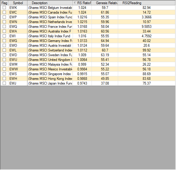
Overall I think this is a good system to be using. I'm using it in conjunction with the relative strength models I often post about. You can actually combine the two models but I run them as separate portfolios. 

I want to point out that I've done tests using a 120 day exponential moving average and got good results. It might be worth looking at that time frame as well. 

If you don't have the book, here is link to Faber's paper on market timing relative strength model. link

Sunday, April 17, 2011

Inflation

If you look at the government numbers we have minimal inflation. Remember back when gas was hitting $4.50 - $5.00 a gallon in some places and food and health care costs were also going up just as fast? The government reported next to no inflation. It was a joke.

The government has been slowly devaluing your currency for ages and they changed the way they report inflation to keep you in the dark. I came across this article today which looks at the way the government used to report inflation, and if they still did it this way today inflation would be over 10 percent, which seems in line with what I'm seeing in my day to day expenses. article

Peter Schiff talks about how the government reports inflation quite a lot in his book Crash Proof. I've been a big fan of Peter Schiff, though I find it sad someone who saw the stock market crash coming couldn't make a profit from it, but I digress...

Another piece of evidence for inflation if through the permanent portfolio. The permanent portfolio divides assets into 5 categories and equal weights them. Precious metals, commodities, growth stocks, treasuries, and swiss franc assets. The ticker is prpfx. It's a mutual fund based on the Harry Browne  concept of the permanent portfolio.


This fund is designed to beat inflation by a couple of percentage points. Why has it been on fire the past decade? It's because inflation has been a lot higher than people want to believe in my opinion. It's done it's job staying ahead of inflation by a couple of percentage points. Sure the chart looks like the fund is kicking @#$ and taking number but not so much when real inflation is taken into account. It probably demonstrates that people are afraid of the prospect of their long term savings losing value. 

 We are becoming poorer every year without realizing it. The sad thing is that when the government is forced to stop printing money things are going to get ugly because we will face the implosion of our service economy. It's a no win situation. 

Relative Strength Investing Weekly Update April 17th

In the Smarter Investing Relative Strength Portfolio I'm running, I had 2 stop outs. One was in IYE, and the other was in IWR.

New buys to be placed for Monday are:

Asset Allocation Portfolio - IAU - I cringe a little at this one but the rules say buy so I buy.

Sector Allocation Portfolio - IYE - Just got stopped out but it's the number one rank. The whipsaw is a little costly since I missed the rally in it on Friday.

I am torn about using stops with this portfolio for a number of reasons. Whipsaw is the primary one.   I decided I would try to follow the plan that Michael Carr put forth in his book Smarter Investing in Any Economy which uses stops. I will keep to this plan and see how it works moving forward. The portfolio should beat the market regardless and will have a much lower draw down than other relative strength investors are probably used to.

I have , however, been doing some more research and put together a method which would not be using stops has a less frequent updating time and is easier to implement. The testing results look good and I'm about ready to go forward with it soon. I plan to put out a post with my test results. I'll also at some point put together some more systematic way to track results. The nice thing is that I can run an unlimited number of portfolios in foliofn and run them independently all free of commission during their trade windows.

The method for calculating relative strength used in this portfolio is the ratio of multiple moving averages. Carr's back testing goes further back than historical etfs since he used mutual fund data and I'm confident in his testing methods. I wish I could duplicate them, but my trading / back testing software cannot make relative strength comparisons between different markets. Check older posts for more details on this method.

The column for the relative strength multiple moving average is the center one that starts with RS.